
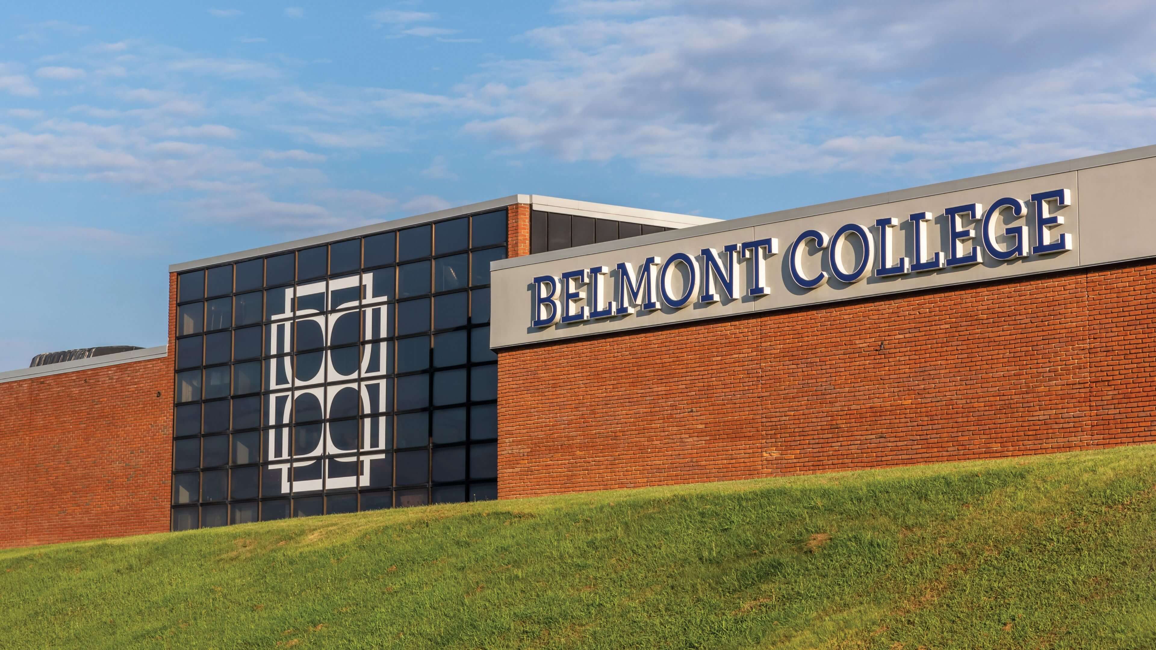
Belmont College’s offerings had expanded in recent years, but their admissions brochure hadn't kept pace. With a marketing team eager to make a strong impression at high schools, conferences, and events, the ask was clear: fit a lot of information into one cohesive printed piece that felt like a conversation starter, not a catalog. The main objective? An enticing, awareness-building handout that people actually want to pick up.
With 50+ programs, scholarship information, transfer opportunities, and info about how to apply and visit campus (and its Starbucks!), figuring out how to make this awareness piece feel light and skimmable would be a fun challenge. Let’s do this!
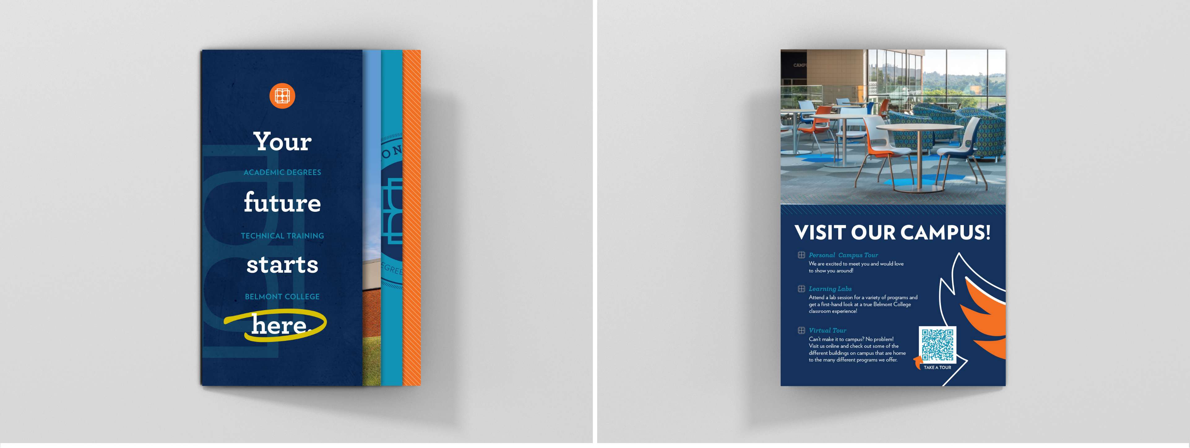
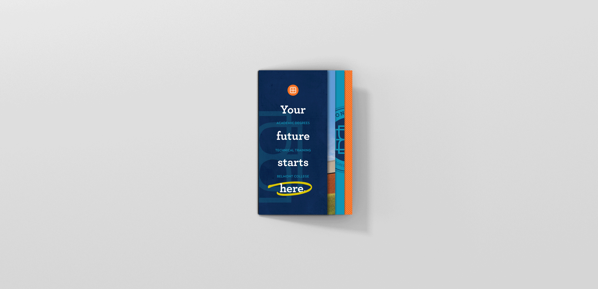
The Marketing Director and I brainstormed a bunch of different formats, and decided on a 5-paneled stepped accordion — front and back. This format was music to our ears because in the stepped accordion, the panels consecutively grow larger and peek through. The result? A colorful, graphic, and memorable piece that’s inviting to the eye, can be handed out easily, and also stands up on a table.
What could have been a basic booklet ended up being a compact curiosity-creator — visual, interesting, and hard to ignore.
Being open to unique formats doesn’t just benefit your brochure; it can also benefit your design partnership. Clients call me an in-house-yet-out-of-house partner, because even though I’m not there, I’m there. Your brochure doesn’t have to be 8.5 x 11. And your design partnership doesn’t have to be generic either.


I know great things can happen when passionate, talented people work together.
Contact me to set up a 30-minute, complimentary video call to candidly discuss your needs, and see if our personalities, aesthetics and working-styles align.
